I met Andrea through a mutual friend when we worked on a logo for Maple Tree Education together (you can see that post here), and since it went so well, Andrea hired me to complete another logo for her "side" business as well.
I highlighted "side" as I did because with all the good work she does through her center for couples in Hawaii, it deserves no less attention than her main career path does.
In her own words, here is a brief description of the Hawaii Surrogacy Center...
"We provide support to families dealing with infertility, and coordinate all services for them (IVF clinic, screening and matching surrogates, contracts for services, escrow and financial management, management of the relationship between family and surrogate, birth plans, all legal work, etc.). We are the first surrogacy agency in Hawaii and nearly all surrogacy journeys in the state are coordinated by us. Most clients work with us for several years (a minimum of 15 months if they get pregnant right away)."
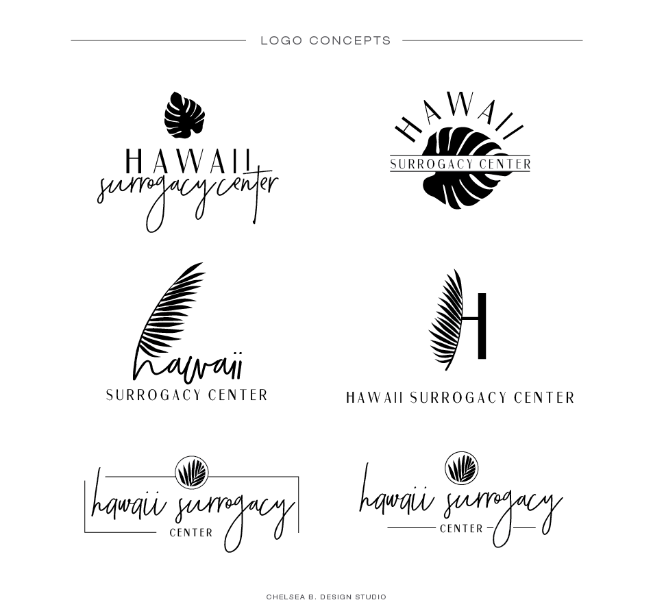
As you can see, she was in need of a logo that really invited her couples into the center, and made them feel comfortable and supported. It's a very emotionally and physically scary, draining process that could last for years, so the thought of walking into a cold, clinical place was something we tried to stay away from. In the same respect, it still needed to have a professional feel to it since couples would be investing a significant amount of money for the services, time, talents, and expertise of this staff.
Combining professional, warm and inviting, and influences of Hawaii seemed like a tall order at first, but once I soon found that there were many common links between all aspects of this brand. Clean, linear lines balanced the organic palm leaves and textures of the land, making for a beautifully balanced logo and feel to the new brand.
You can find out more about the Hawaii Surrogacy Center on their website highlighted here.
Until next time...
Wishing you all the best in love, business, and life,
Chelsea B.


